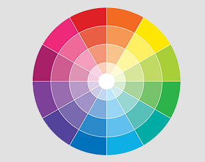
What are the best colors for logo design ?

logo-designer-in-pune-maharashtra
Introduction:
Colors do have a major role in designing a Logo. The color adds beauty to the image which is registered in the mind of a customer. Colour of a logo not only enhances the value of the text or the symbol but also is responsible for carrying the brand value of the company to the customers in the market. Deciding color schemes is an important procedure in the process of designing a logo and professional work on this to make out a best possible logo.
Importance of colors:
As mentioned earlier, the colors add value to the logo. Each color brings out a different and unique value and no two colors have the same effect. So, the grading of different colors becomes important in this context. Each company has its own requirement and its own set of target customers.Hence, using a particular color brings the desired outlook of the logo and thus it perpetuates into the right market.
Usage of Different Colours in Designing Logos:
The usage of colors varies with the type of logos used. Each logo has a story behind it and there is a statement made through each logo. For example, Coco-cola is labeled red, IBM is labeled blue etc. There is an intentional meaning behind choosing all these colors. To understand this, any logo designer has to definitely know the psychology of colors i.e. the science of colors, the meanings they possess and the situations which they represent.
Colour and its Meaning:
RED:
Red generally represents danger, emergency, important or any other strong feelings. According to the optics,red has the highest wavelength and it is seen from very long distances. So red is used as a sign to represent some serious emotion.
Therefore, companies with food business, beverages, hospitals, Thermal Plants etc. have their logo in red color to indicate the extremity of danger or such kind of emotion. Sometimes the mascots of some logos have red colorin the background and with the words in different color.
Examples: KFC, Coco-cola, Kingfisher


BLUE:
Blue is always used for authentic or promising purposes. It brings out the appeal of some professionalism and it also looks cool as a sea or the sky. It generally represents the language of being confident.
So, many corporate companies prefer logo with Blue color to get that professional look to their logos. Blues brings that feel for the corporate offices.
Examples: Whirlpool, IBM, Samsung


GREEN:
Green represents the nature or the bio-diversity possessed by the earth. Green is a symbol of good doing and it is one of those colors with high wavelength.
Any company which part of the natural products is generally prefer green. It also represents freshness and promotes vegetarianism.
Examples: Heritage Diary, Himalaya Beauty Products, many resorts also possess green logos.


YELLOW:
Yellow is a sign of being cautious or complaining. The yellow is generally used for warning or to show caution for someone. It possesses a tone like alerting or alarming tone.Sometimes, it is a symbol of cowardice too. It also possesses the shade of optimism.
Examples: Nikon, Subway contain yellow along with some other color.


ORANGE:
Orange represents the ‘rising sun’. It is generally used for something which is new or something which carries the feel of creative thinking.
So, companies which work on innovation or new enterprises use an orange logo.
Examples: Amazon, Fanta, Marinda
![]()


BLACK:
Black consists being an extreme or something which is dominant. Black brings in the feeling of being evil (sometimes) and it also brings the feel of power. It is dominant as well as malign.
Black is used as a dominant feature and it is also used with many other colors so that the visibility factor increases when the colors are shown along with black.
Examples: Fila, Adidas, and many other sports logos are black.


WHITE:
White always represent calmness as well as promote the concept of humanity or quality of purity and simplicity.
Many companies use white as one of the combination colors. The white outline brings them a great look.
Example: Apple.

PINK:
Pink is one of the brightest colors and thus it brings a great finish to the logo. Pink also represents women or feminism.
Companies which support any cause or any NGO who work for the cause of women generally choose pink as their logo to address the cause easily. Using pink makes their work easy as the agenda is passed without barriers.
Examples: Barbie, many women NGOs.

Also, with the globalization and companies entering into multiple business firms, the spread of companies has been throughout the world. So, companies have taken clear measure that the logo reaches out to the maximum sect of the population all over the world. This has led to the usage of multiple colors with bright backgrounds so that they can grab the maximum attention of the customers.
Companies with multiple firms chose a different color in the logo to represent different types of businesses. This is how colors play an important role in designing the logo of a company or organization.
Conclusion:
The importance and the inner voice of the company are depicted in its logo and the colors used on that logo give it a life. There is no certain color that is granted as the best color to design logos but the cause and requirement should decide the color. The designer might use any color but the optimum brightness and optimum usage must be checked throughout to make it look simple and convey the right meaning to the right customer.


 Chat with us